Branding & Website Design

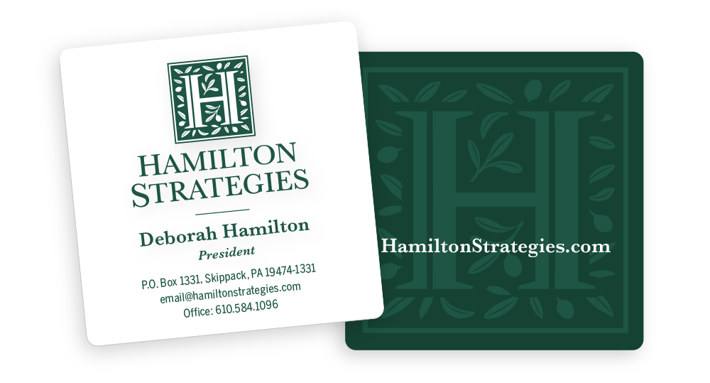
As a leading public relations firm in the conservative arena, Hamilton Strategies has been serving it’s clients for over 20 years and continues to be one of the top firms in their category. They needed a fresh look that would appeal to a new generation along with a platform to showcase their media samples. The dark green has been a mainstay for the company, and the H in intended to look like columns that represent the public forum. We substituted the curvy lines with olive branches as a symbol of fruitfulness and peace. Olive trees have deep roots which help them to thrive in the desert, and they produce fruit despite challenging circumstances.


Original Logo
Business Cards


