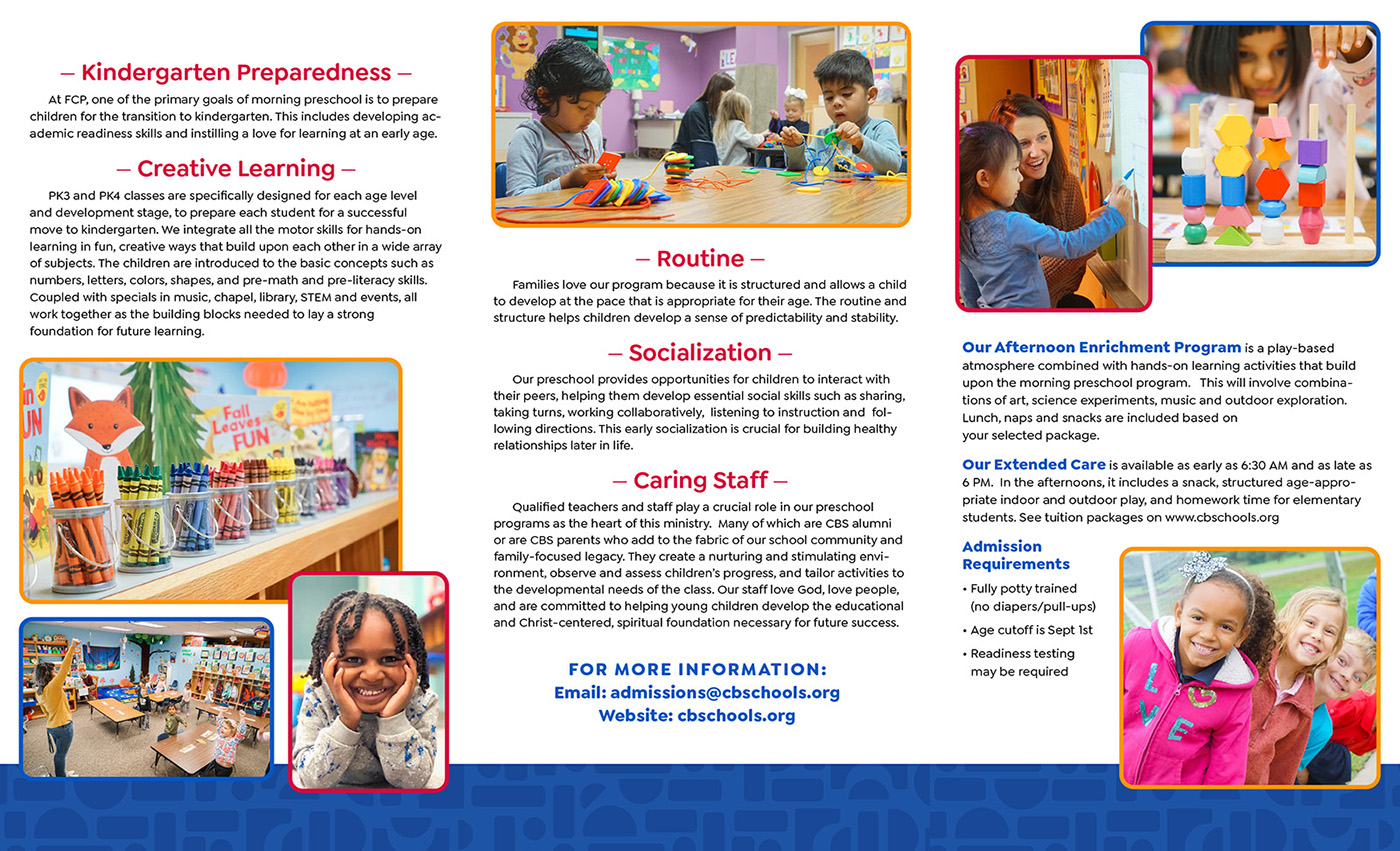
Foundations Preschool
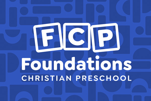
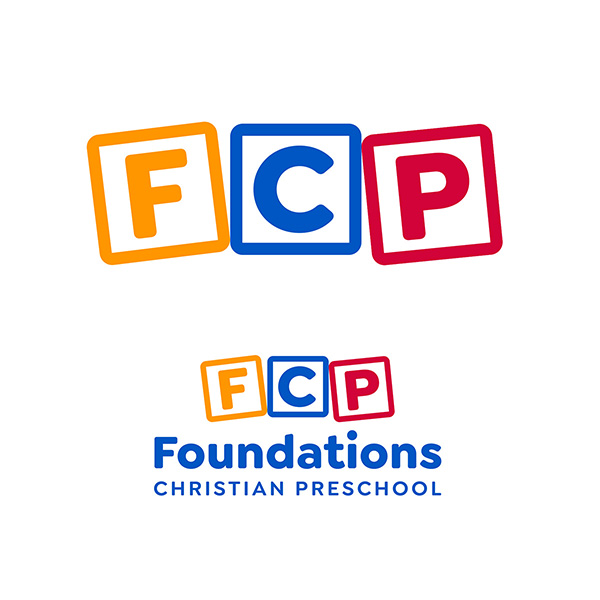
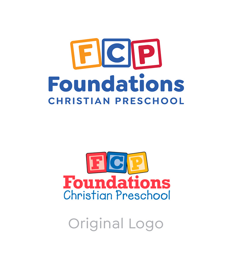
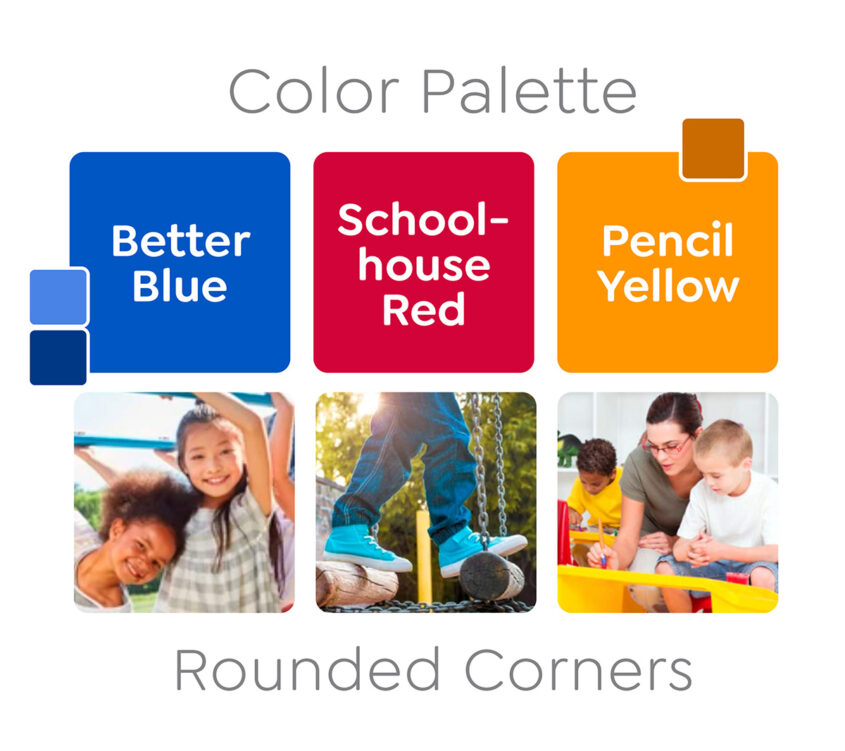
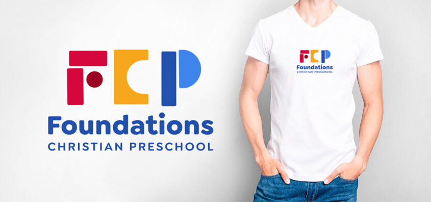
To freshen up the brand, the original logo needed some sprucing up. We explored several design concepts, but decided that the brand recognition of the three blocks and primary colors was a good thing to keep. We chose a yellow that was easier to read when on a white background and adjusted the red a bit. And the updated fonts are easier to read and more relevant to today’s culture. You will see that the other options were definitely more forward thinking and creative, but they just didn’t fit the objectives. However, we did carry over the alternative background pattern of blocks in blue, since it gave it a unique touch, and the subtle FCP is still hidden in the blocks.
Logo Concepts & Color Palette
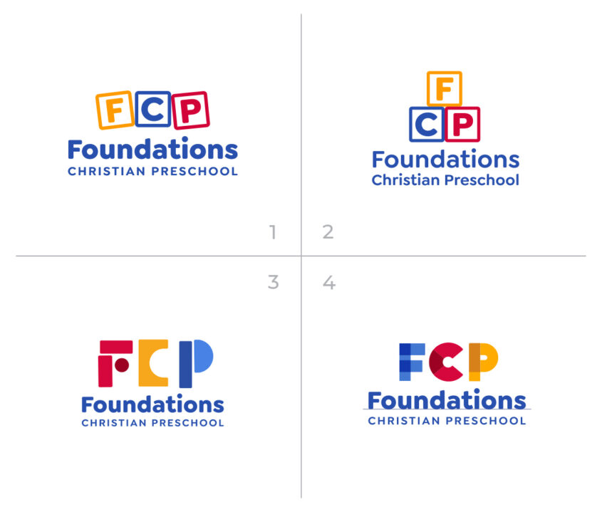
Alternative Logo Exploration
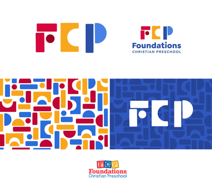
Final Chosen Logo & Elements