FinHub Branding
CrossGate Financial
CrossGate is a financial planning company with an online tool that they developed, called FinHub. Using “fin” as an abbreviation for financial, we played on the fish-fin idea. And then thinking about the word “hub”, we arranged them in a circular pattern which looks like the fish are feeding on food.
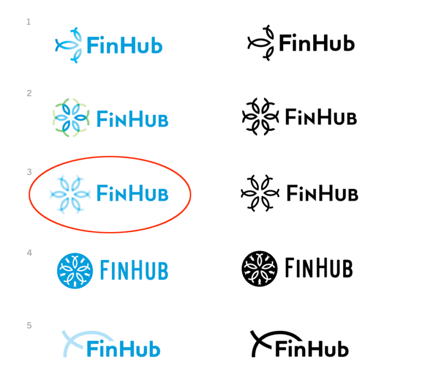
The first round of logo concepts shows the designs in color, along with a simplified version of each in black. After a round of review, No. 3 was chosen, and the design process progressed from there.

They wanted to tie in their standard navy blue. We also added some lighter shades of blue for some variation, and that also made the separate fish easier to decipher. We played around with various line weights too to see if any of them would work better.


We decided to liven it up a bit and add another color, similar to one of the original concepts, so we added a vibrant green. The arrangement of the colors was varied, and we decided that we liked the simplicity of the colors grouped together instead of it being broken up as much.
And here you can see the progression of the shapes that were divided to make the final outlines.

And here is the final product. At the last minute, the client decided to make the letters upper and lower case instead of all uppercase.